Nuqlea
Role: Web Design, Graphic Design
Timeline: 5 Weeks
Tools: Figma
Team: 1
Nuqlea is a startup based in Buenos Aires that is changing the way constructors source building materials by streamlining the sourcing process.
As an experience design intern, my main task was to help bring their website visions to life. I also assisted in designing graphics for potential use and translating copy for investor presentations. For this project, I worked with the Chief of Staff, their Graphic Designer and other Nuqlea employees.
Background
Company Overview
Nuqlea is connecting constructors with manufacterers to change the building process in Argentina. They do this with a custom ecosystem that connects each individual party seamlessly. There is a weblike network of people who need materials, and Nuqlea is at the center guiding them to one another.
Problem
Nuqlea has a condensed website with a growing number of clients/potential clients in search of relevant information. They were looking to expand parts of their website to better reflect their company culture.
Process
Understand the company & business needs | talk to stakeholders | assess the overall structure of the site | ideate | wireframe | prototype
Outcome
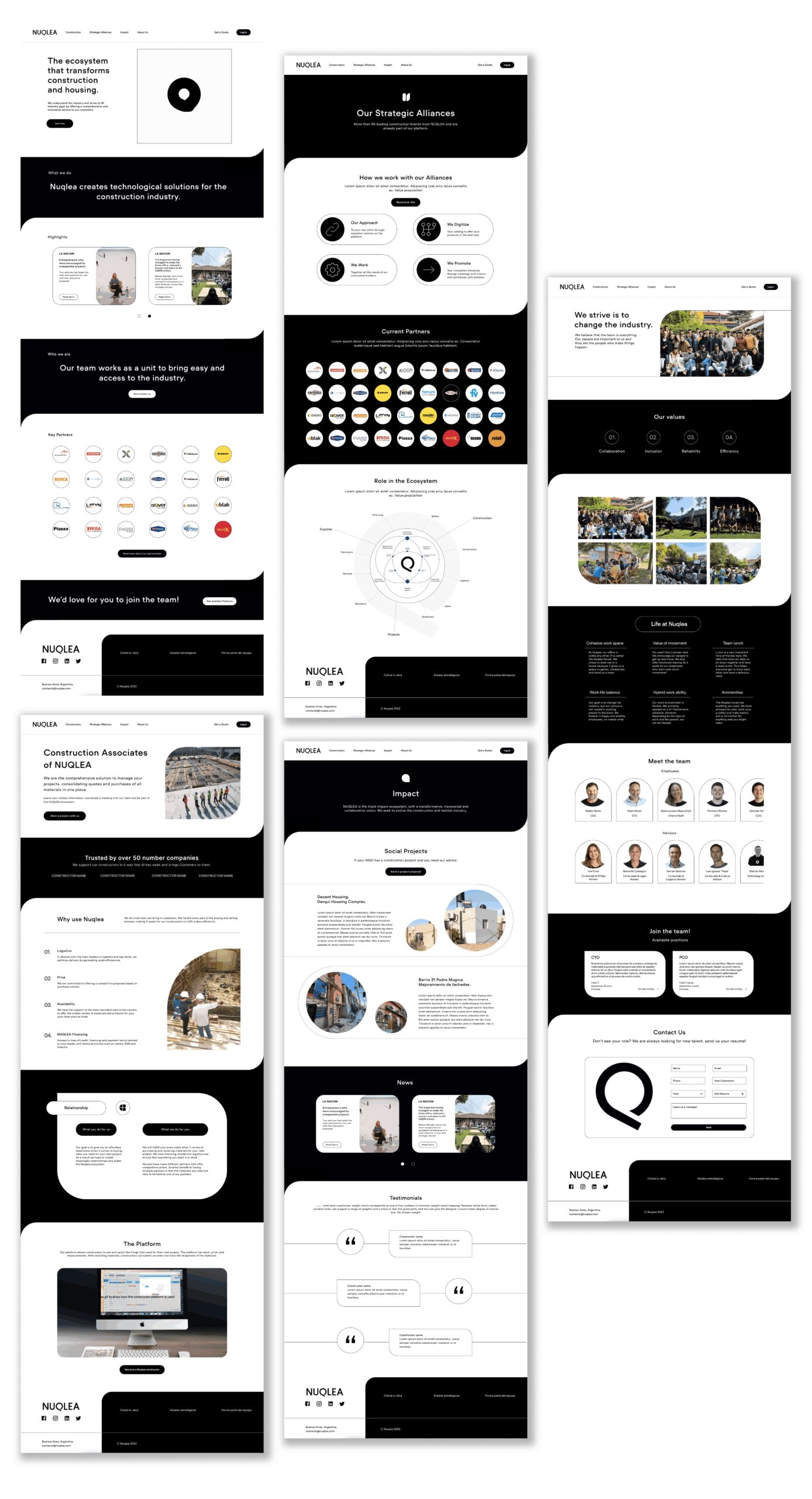
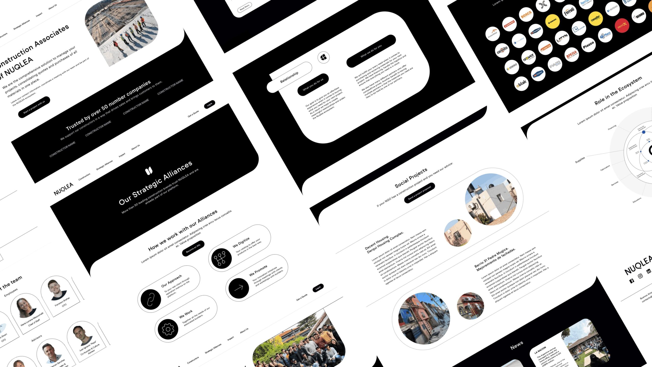
Within my 5 weeks, I created 4 expanded webpages, created an updated home screen, and a responsive job posting that was developed two weeks later.
Process
UNDERSTAND
Understand the company
My first few days at Nuqlea consisted of learning about the business and what they offer. I was given an introductory presentation on the business strategy and provided their brand book which I would be refer to as I worked. After getting acquainted with everything and my role, I began to dive into the problem.
Talking to stakeholders
To understanding the business goals and their needs, I conversed with stakeholders. Their target clients included industrial suppliers and developers. I was not able to interview customers, so I used company provided information and stakeholder interviews to made strategic desicions that drove my designs.
Website anaysis
With the information provided, I dove into the existing site and analyzed the provided information while noting possible areas to expand upon. Right off the bat, the website was a single-page design with limited information.
DEFINE
Nuqlea stakeholders wanted their site to reflect their culture and show off the people who made the business possible.
The overall goal of this project was to expand the Nuqlea website and supply information for potential partners and clients while maintaining brand consistency. Key information pertained to the value proposition.
IDEATE
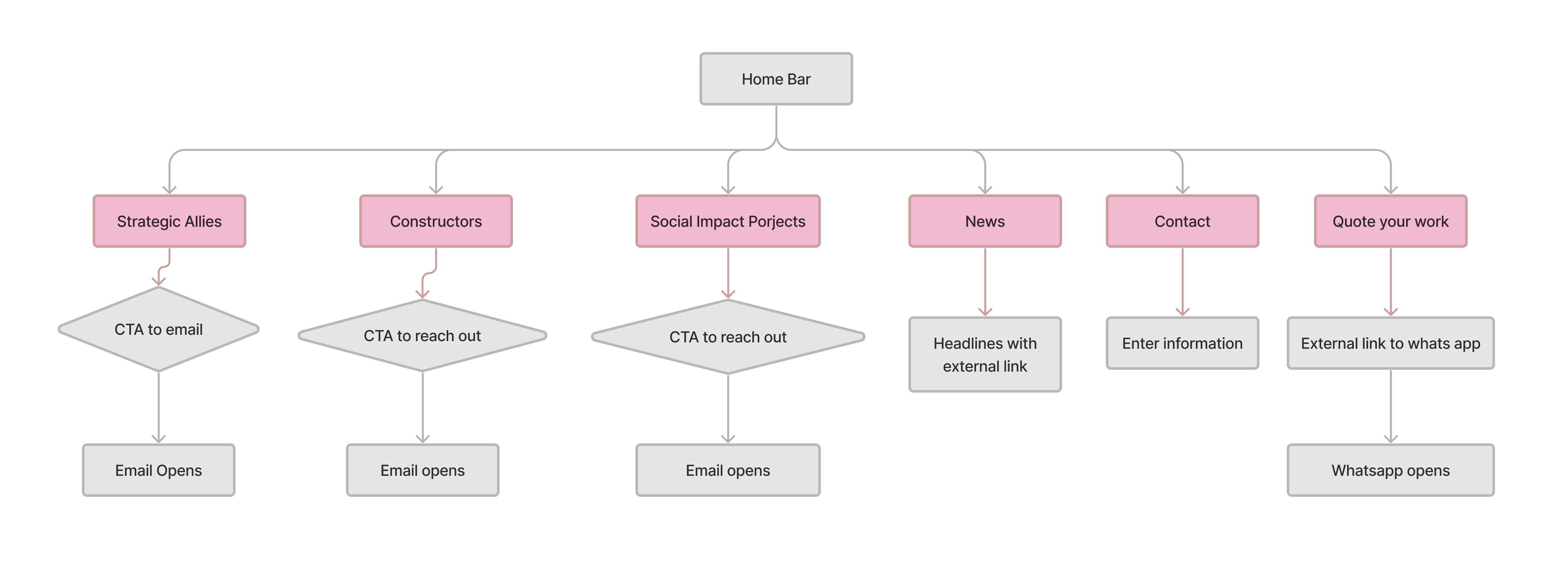
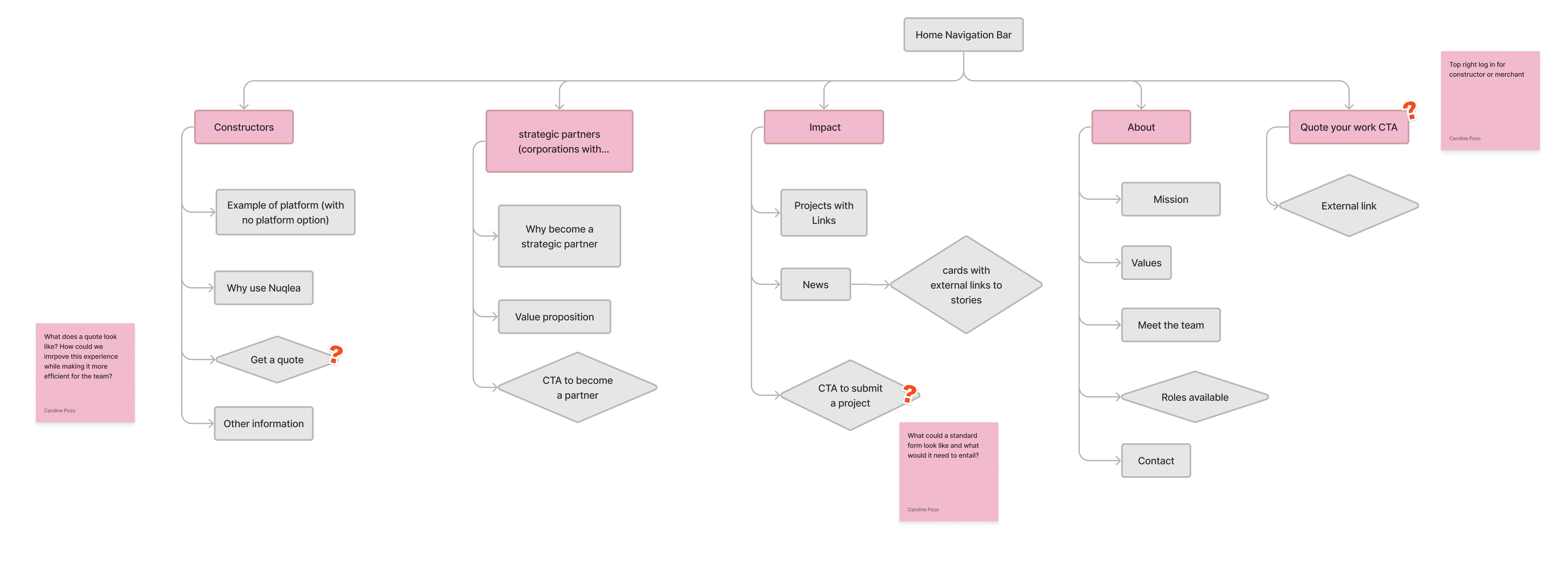
The information architecture needed to be expanded in order to provide clients and potential clients with the information they need to make an informed decision.
To expand the current site, my first step was to expand my overall information architecture. Sitemaps helped me visualize what the website was positionally missing and visualize what areas could be expanded upon. I was constantly recieving feedback to ensure I was meeting business goals.
Inspiration
After going over the existing site in depth, I was curious about what other start-ups included in their sites and about how they chose to lay them out. I created an inspiration board and took noted the information included.

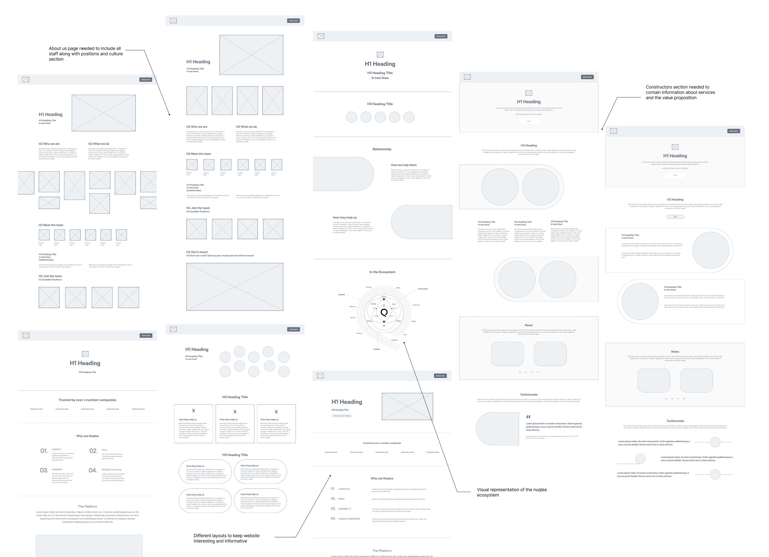
Sketching & wireframing the winners
With the solidified information architecture and inspiration, I began to sketching and wireframing the winners in order to see which concepts resinated based on composition. I worked with the Chief of Staff and other employees to get feedback on wireframes. Winners were chosen based on structure, composition, and uniqueness. The main question I asked myself during this phase was how might we lay out valuable information in a visually interesting way?
PROTOTYPE
Shifting to high-fidelity
Once the final wireframes were chosen, I begin to add content while referring to the brand book for consistency. As I added sections, I also prototyped micro-interactions that aligned with their currently interactions to add interest and flair.
USABILITY
Through feedback from cross functioning team members, I was able to test website functions that focused on learnability and satisfaction.
Though we expanded information, making the site more dense, stakeholders typically said the website was efficient in bringing the value proposition to light and showing the Nuqlea culture. Similarly, satisfaction with the expanded content was very high and well received. Throughout the wireframing stage, I was able to make small improvements that allowed the final mock ups to be effortless.
OUTCOME & TAKEAWAYS
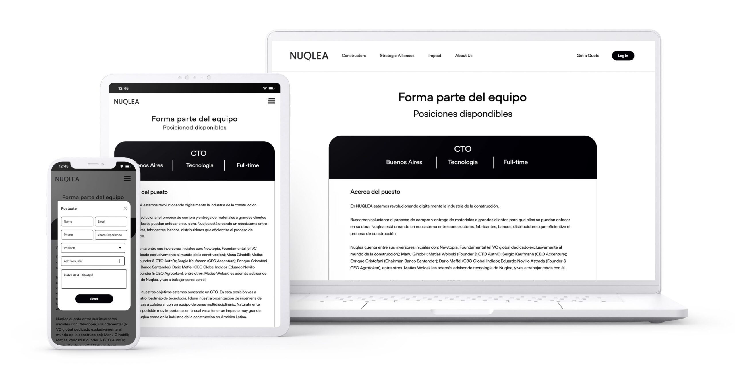
At the end of my 5 weeks, I created 5 web pages, an interactive prototype, and had a responsive job posting developed. This allowed staff to begin hiring straight from their website!
I was able to work very closely with the team and was given continuous feedback throughout my design process in order to maintain alignment with the business goals. I tested each page with stakeholders after it was completed. I took their feedback and used it to tweak designs. One major take away was that I tested with high-fidelity which lead to alot of restructuring when I needed to make updates. In the future, I will test my pages with wireframes to increase productivity.
Working at Nuqlea was an amazing experience. While I gained experience is problems solving, I also learned so much about the company, it’s people, and the Argentine culture as a whole.
Final Screens
