HERTZ TNC
Role: Product Design
Deliverables: Clickable Prototype
Tools: Figma
Timeline: 2 weeks
Team: 4
Client work completed through the CMCI Master’s program.
Hertz TNC is a branch of Hertz that focuses on electric vehicle rentals to transportation network companies such as Uber and Lyft.
Drivers rent TNC vehicles for work in order to limit wear on personal vehicles, increase tips, and gain perks such as 24/7 road side assistance. Hertz TNC’s main goal was to increase the number of EV rentals with a goal to surpass gas vehicle rentals. My role was to help alliviate a number of pain points that the company presented to us while using their research to drive the design.
Background
Rental Process
Hertz main EV fleet consists of Teslas, which are currently available to rent thought the Uber or Lyft app. After scheduling a rental, pick up is at a local Hertz TNC branch. Branches are often spread out making it a lengthy commute for drivers. Uber does offer a reimbursement for transportation to the branch but only if the drive is within a certain range. Next, there is a lengthy onboarding process or a rental renewal process. Drivers need to renew their rental contract every week at the branch they picked up the car from and, on top of that, they need to drop off their rented Tesla every 28 days for cleaning and maintenance.
Problem
For Hertz to increase their profits and rentals, they needed to decrease customer churn, improve their brand experience, and reach new customers with their value proposition. Even though they had multiple issues to solve for, Hertz wanted us to focus on one specific area to improve. We chose the avenue which would result in the most improvements.
Process
Review the brief | Understand the competitive space | Use given data to create empathy for our target user | Ideate & prototype
Outcome
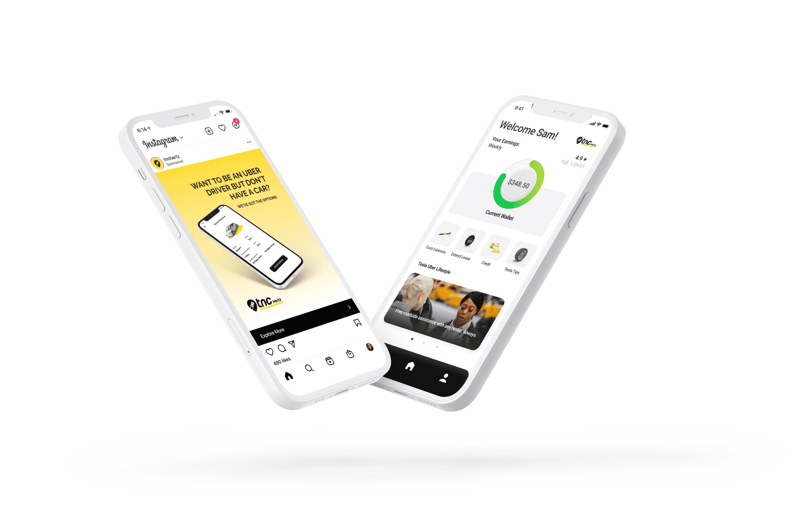
A mobile tool that is a one stop shop for drivers to track expenses, earnings, renew contracts and more. Branding solutions that are based on customer recognition and outreach; aiming to grab new customers attention and keep them coming back.
Process
UNDERSTAND
Brief
Our first course of action was to review and analyze the brief. Hertz had archetypes and metrics that described their target customer. They also gave us user research insights to design for. This was helpful because we did not need spend time on this step. We took the information given and began to turn it into a story to guide our designs. We also wanted to know what other companies were doing and how we could stand out from the crowd.
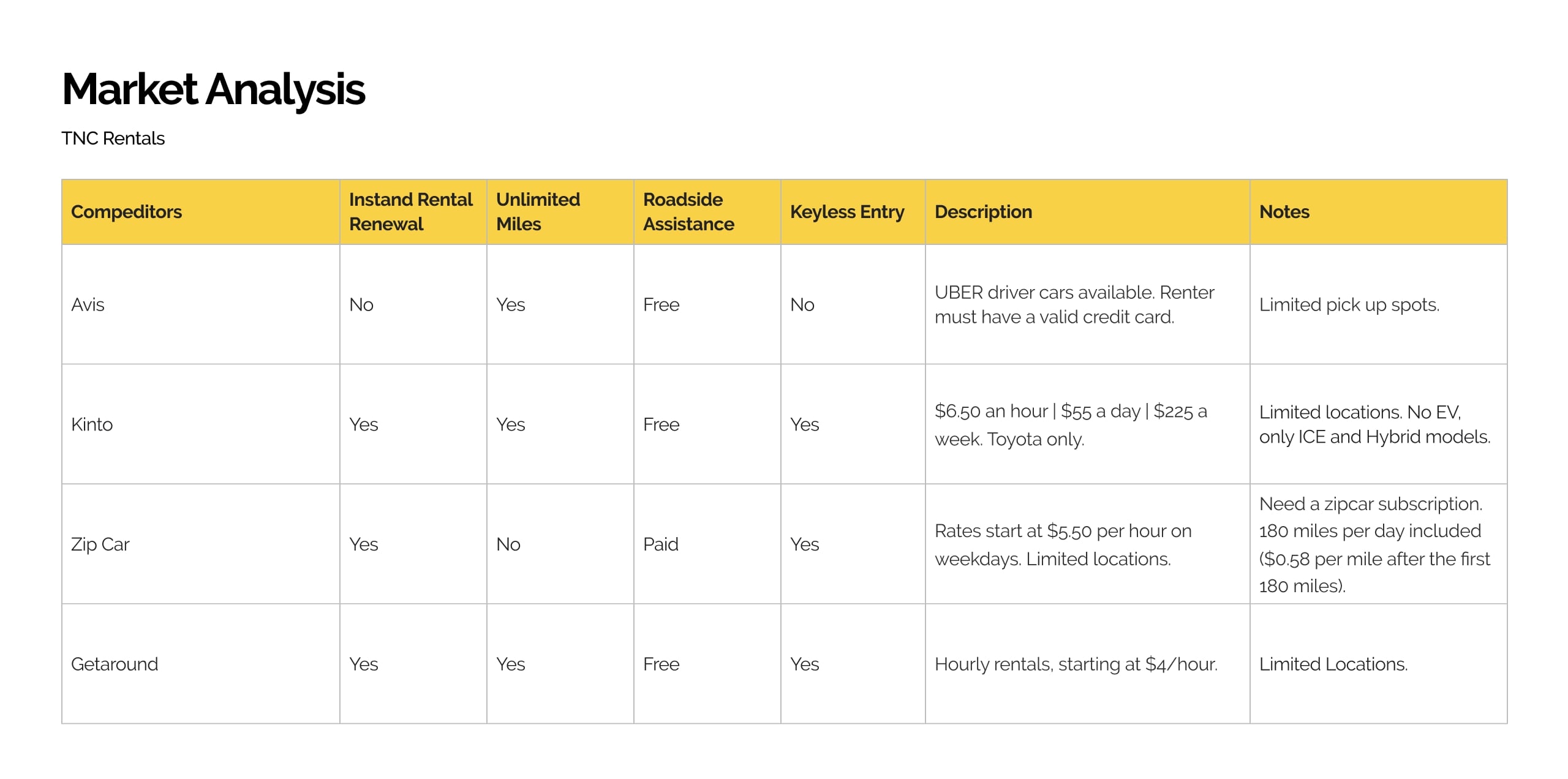
Analyzing the market
It is important to understand what solutions already exsist. We looked at companies that offer similar services as Hertz TNC in order to uncover potential niche areas. We focused on Avis, Kinto, Zip Car and Getaround. Our research indicated that many rentals have flawless pick up options such as contactless pickup, instant rental renewals, and cheaper pricing models. Where we stand out is with the fleet of fully electric Teslas.
DEFINE
Using the information in the brief, we defined personas to highlight the customer’s most important pain points.
Using the information in the brief, we created personas to highlight the customer’s most important pain points. Three personas were created in order to highlight the most common users. Below are examples of a new customer and an existing customer. Key pain points involved drivers often have part time jobs or drive full time, drivers are often needed to be highly aware of their bottom line, and they often needed to track expenses elsewhere for various reasons (taxes, income tracking, expenses, ect.)
DEFINE
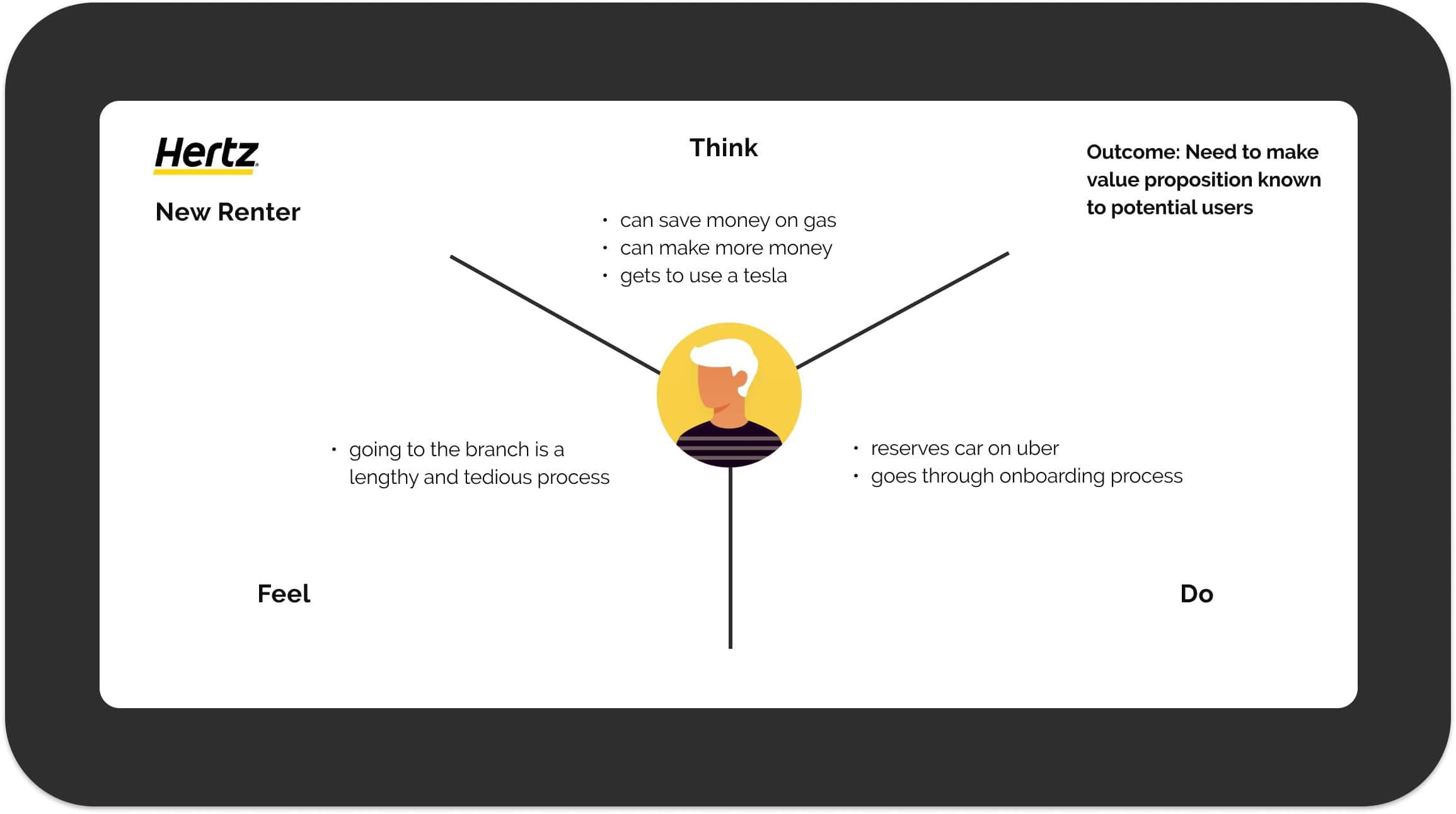
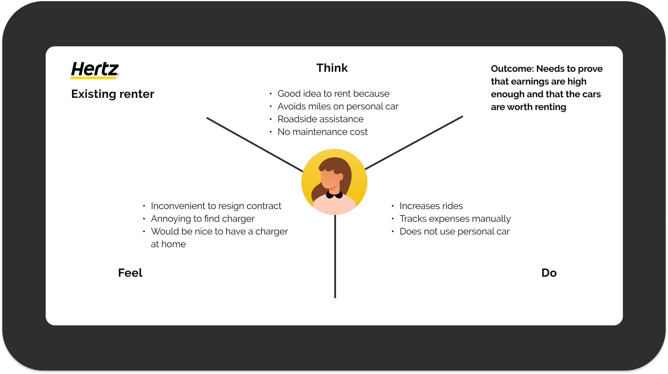
Next, we wanted to understand the primary feelings and actions of our users. Using empathy maps, we could focus on these points throughout the rental process.
Each empathy map was created for a different persona, and each led to a different core focus. We found that there are two things we really needed to focus on, and those were the value proposition and the customer retention.
CUSTOMER JOURNEY
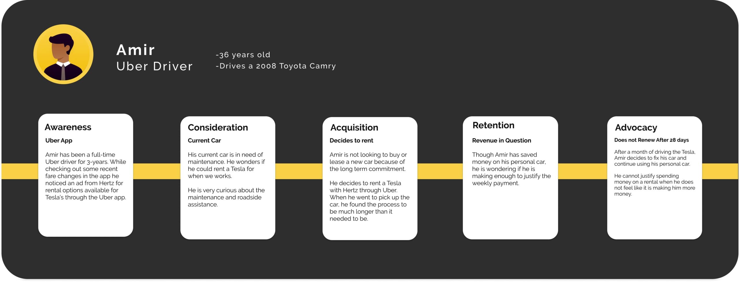
The customer jouney highlighted the fact that we needed to reach customers with the value proposition before designing any other solutions.
Lastly, we created a user journey to visualize Amir’s experience from start to finish. This was meant to highlight his thought process when thinking about renting a Hertz TNC Tesla. We walked through his pain points and his circumstances that lead to a decision.
PROBLEM
Hertz needed to reach customers with their value proposition and make the rental renewal process more accessable for drivers.
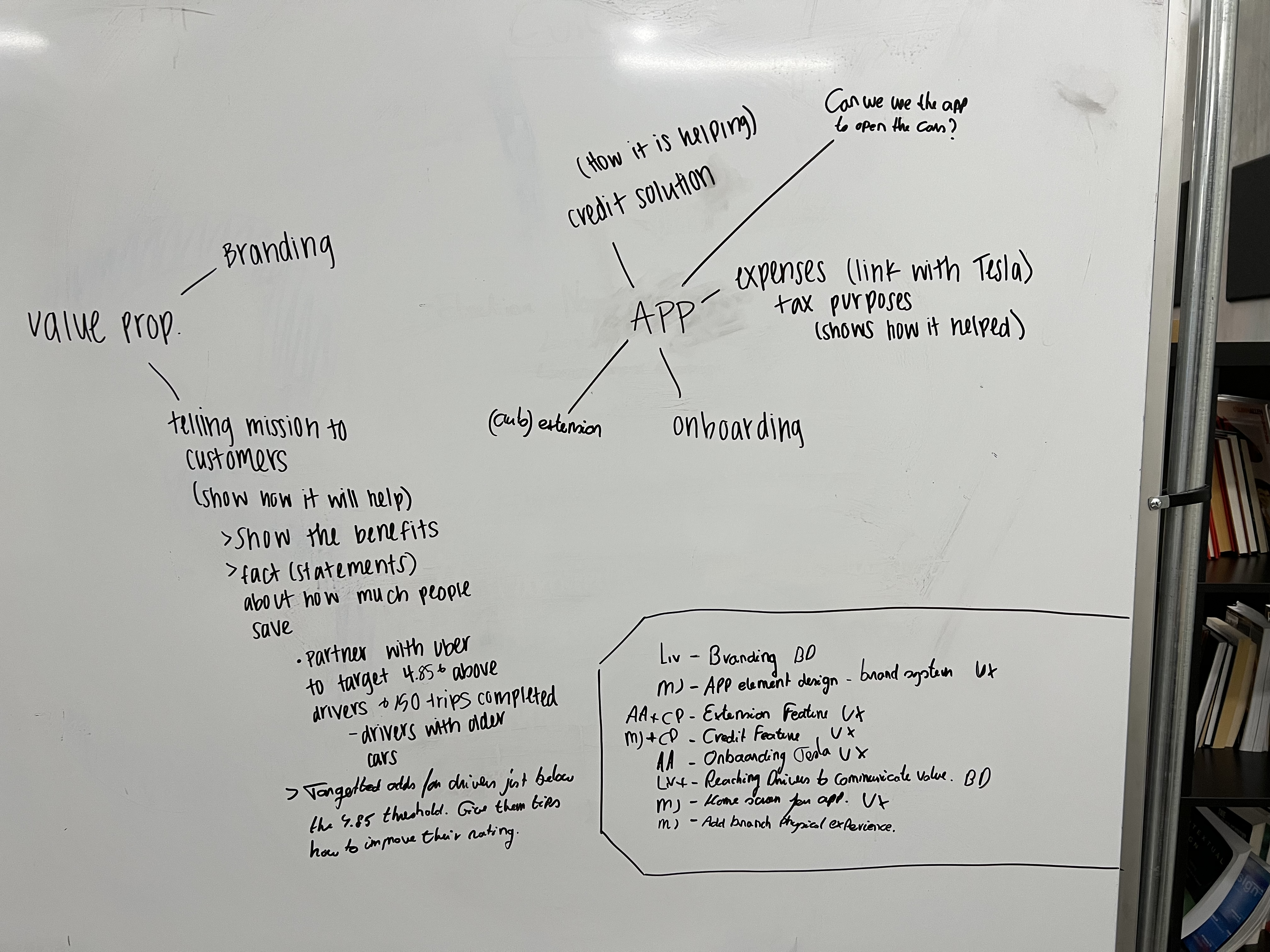
Using our findings above, we decided to tackle more than one problem for this project. We came up with two HMW questions to help guide our ideation. How might we create brand recognition and convey our value proposition to potential users? How might we make the rental process at Hertz TNC frictionless while alleviating financial pain points for our drivers?
Our next steps were to develop brand solutions and a mobile tool for drivers. My role was to help develop the mobile tool.
IDEATE
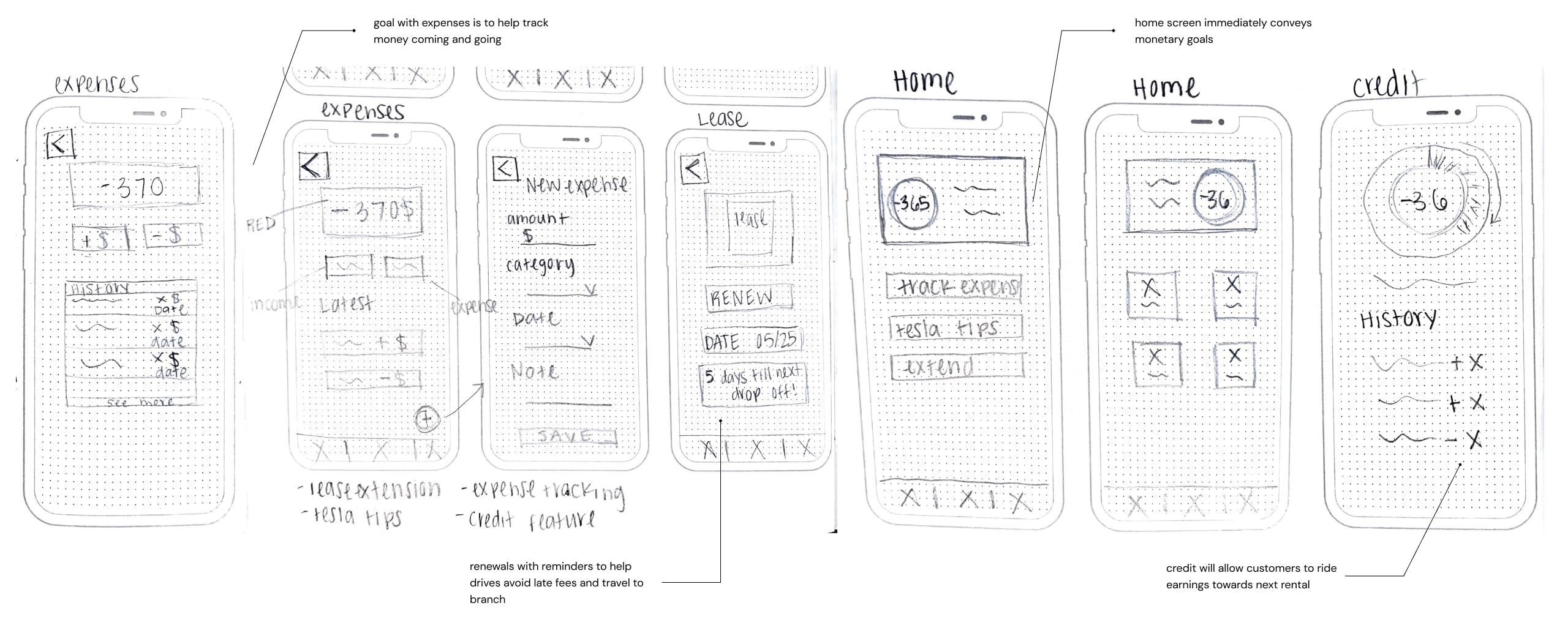
We took the problem and began ideating by sketching any and all ideas which we then wireframed. We chose which sketches to wireframe based on user needs.
My team member Aaron and I were tasked with the UX and UI of the mobile app. Below are a few examples of my personal sketches. Aaron and I brought together all of our ideas and began to pick the most promising based on key user tasks that they team decided above. After deciding which sketches to move forward with, we began to wireframe to visualize how the tool would look before adding content and branding to the design. It also helped us decide which layouts were best suited for each function.
Sketches
Wireframes

PROTOTYPE
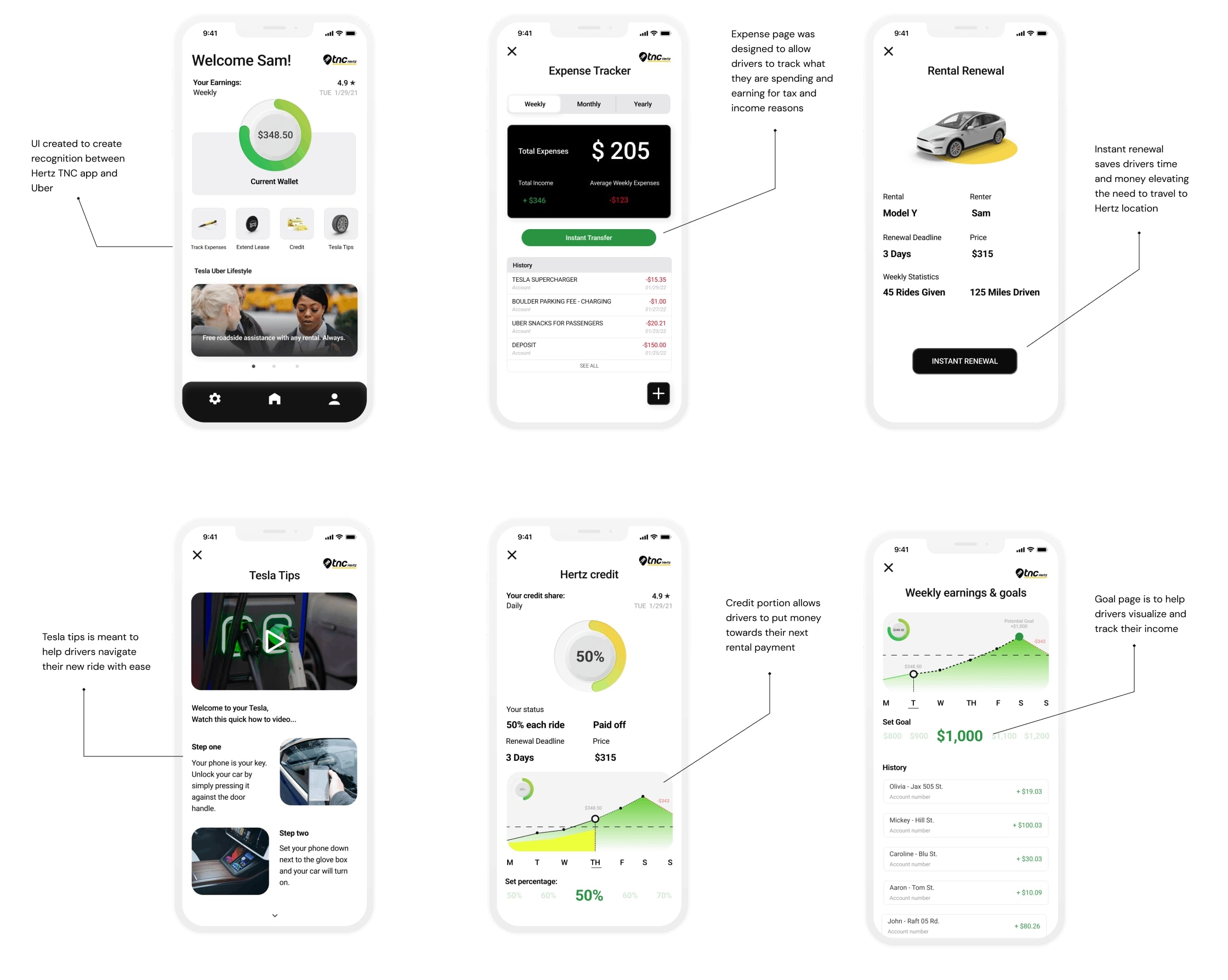
With our most tackticle wireframe, we shifted to high fidelity. Our goal with this mobile app was to help drivers track expenses, earnings, and more.
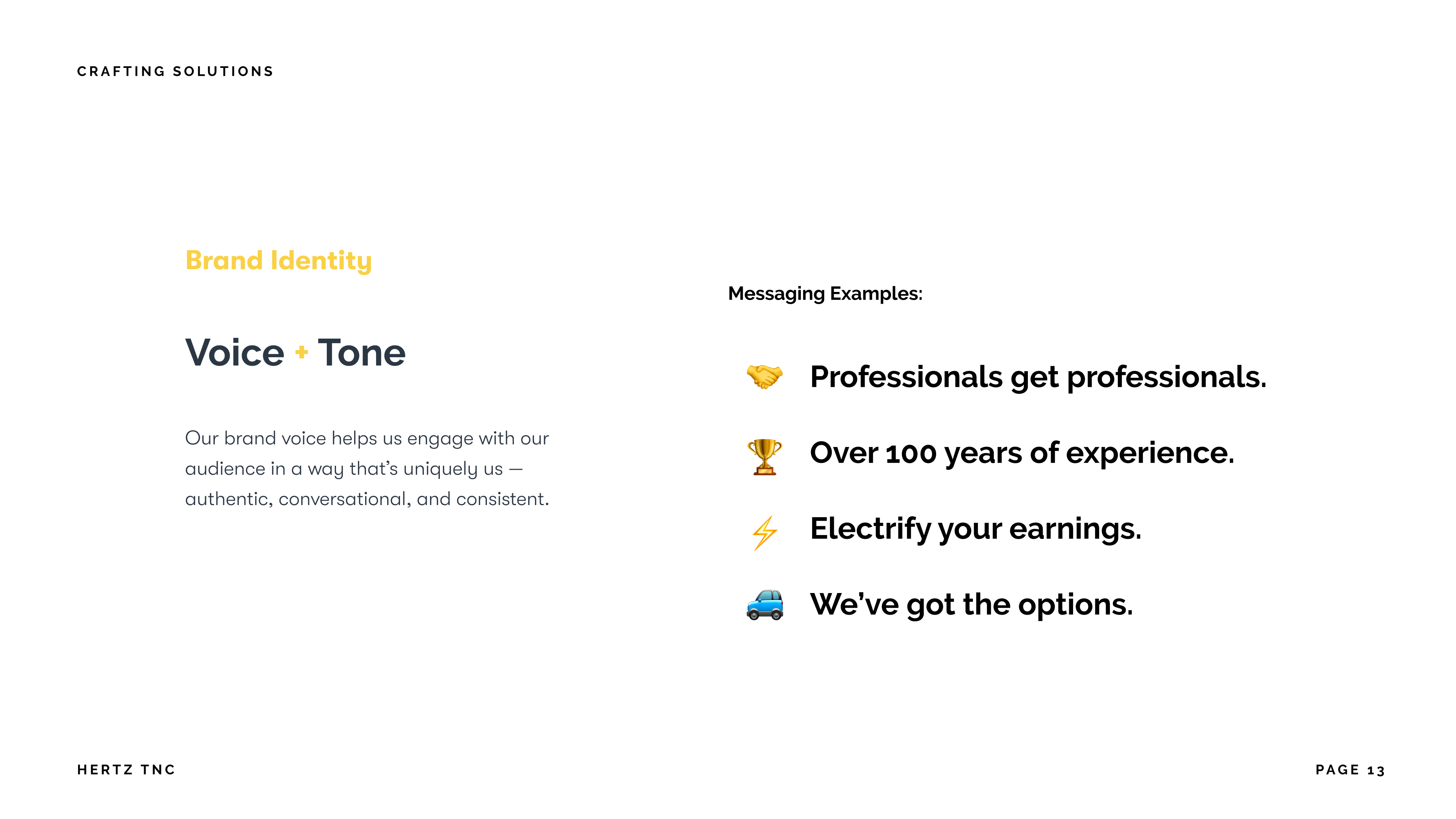
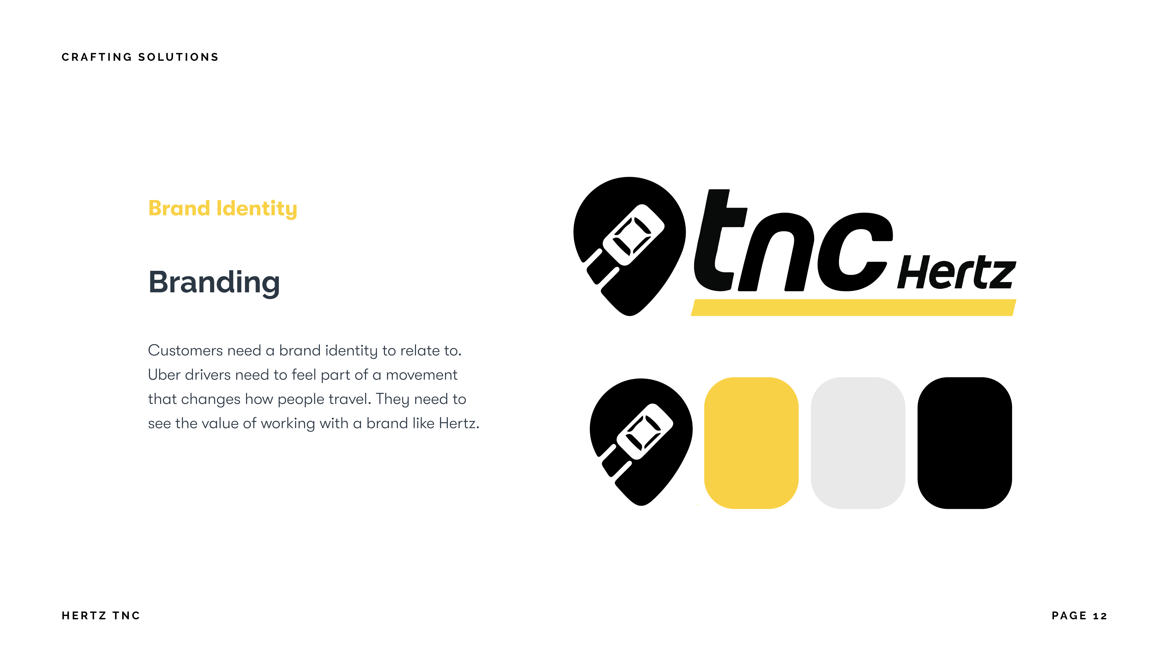
Brand solutions were developed to help new and existing drives understand the Hertz value proposition which would them lead them to using our tool. Our goal with the UI was to design it with Uber artifacts in mind. This way, our users would be using two apps that work in unison with one another. Our drivers will be using both apps so we wanted to create recognition while keeping to our Hertz TNC branding.
See presentation for our full slide deck!
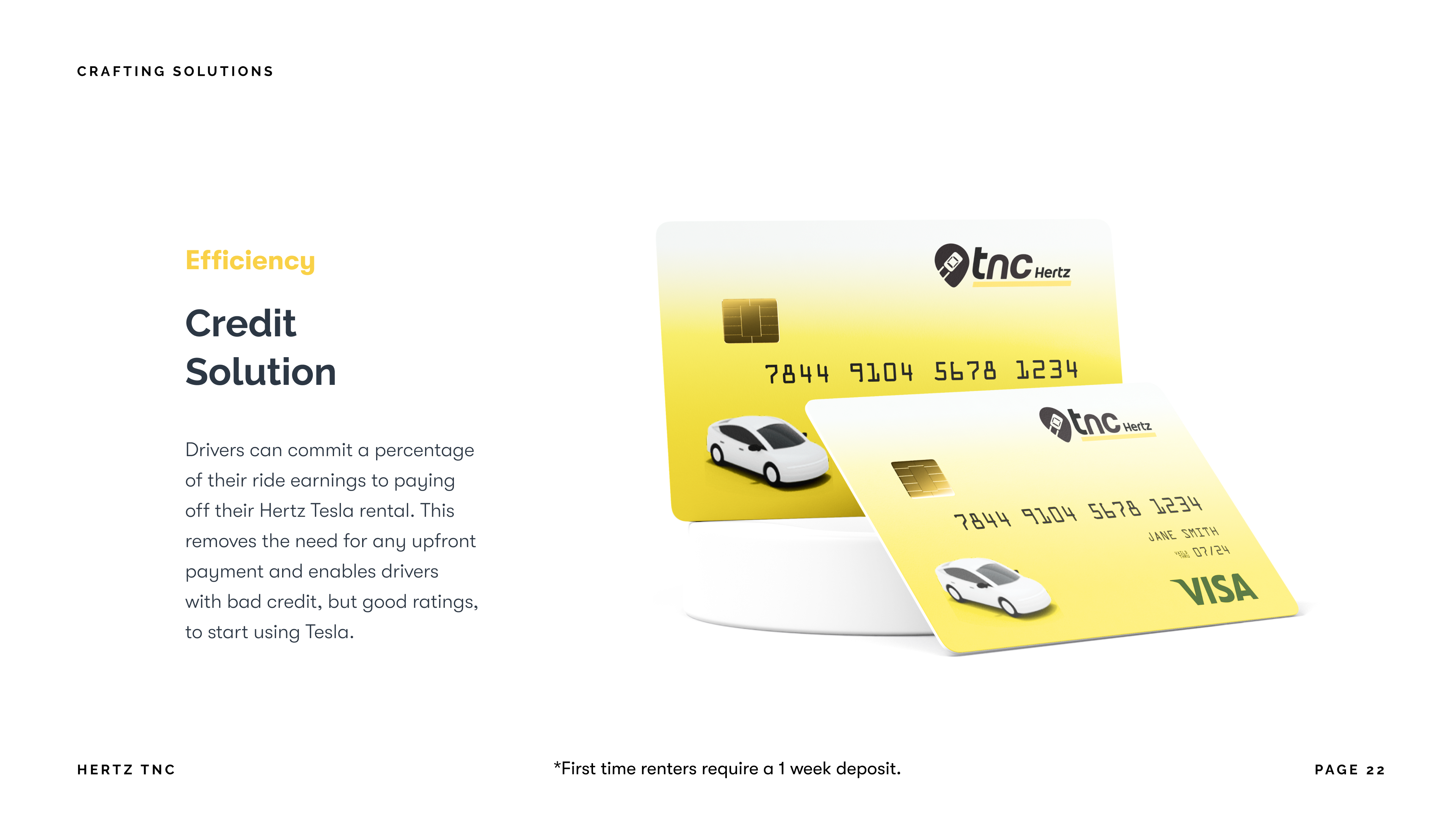
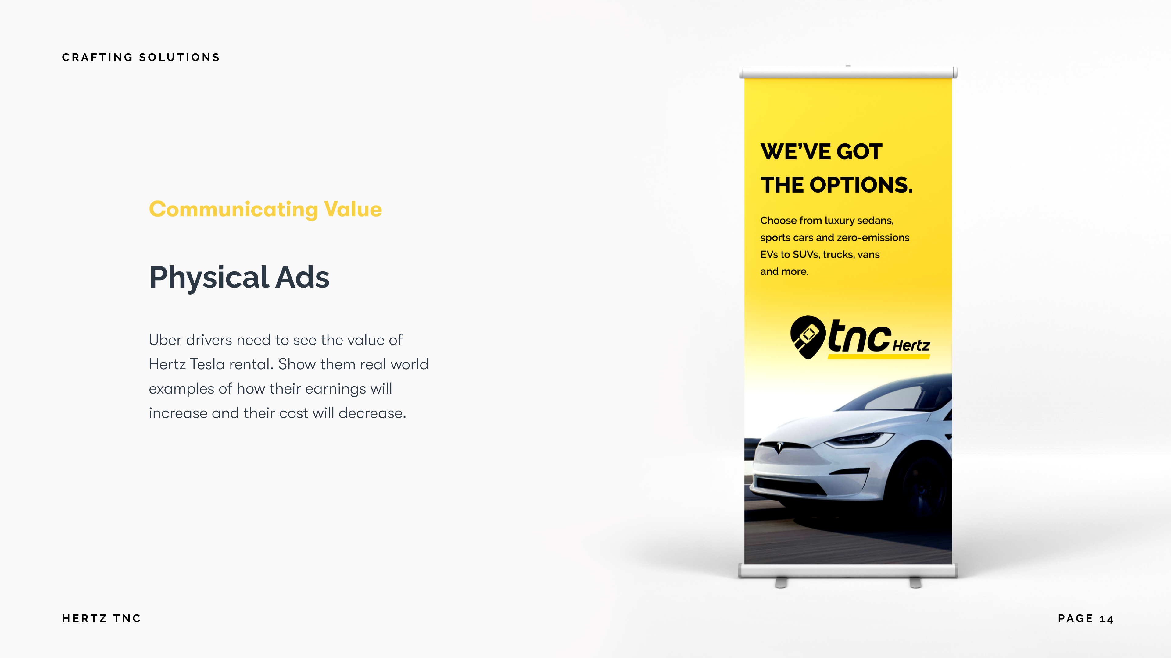
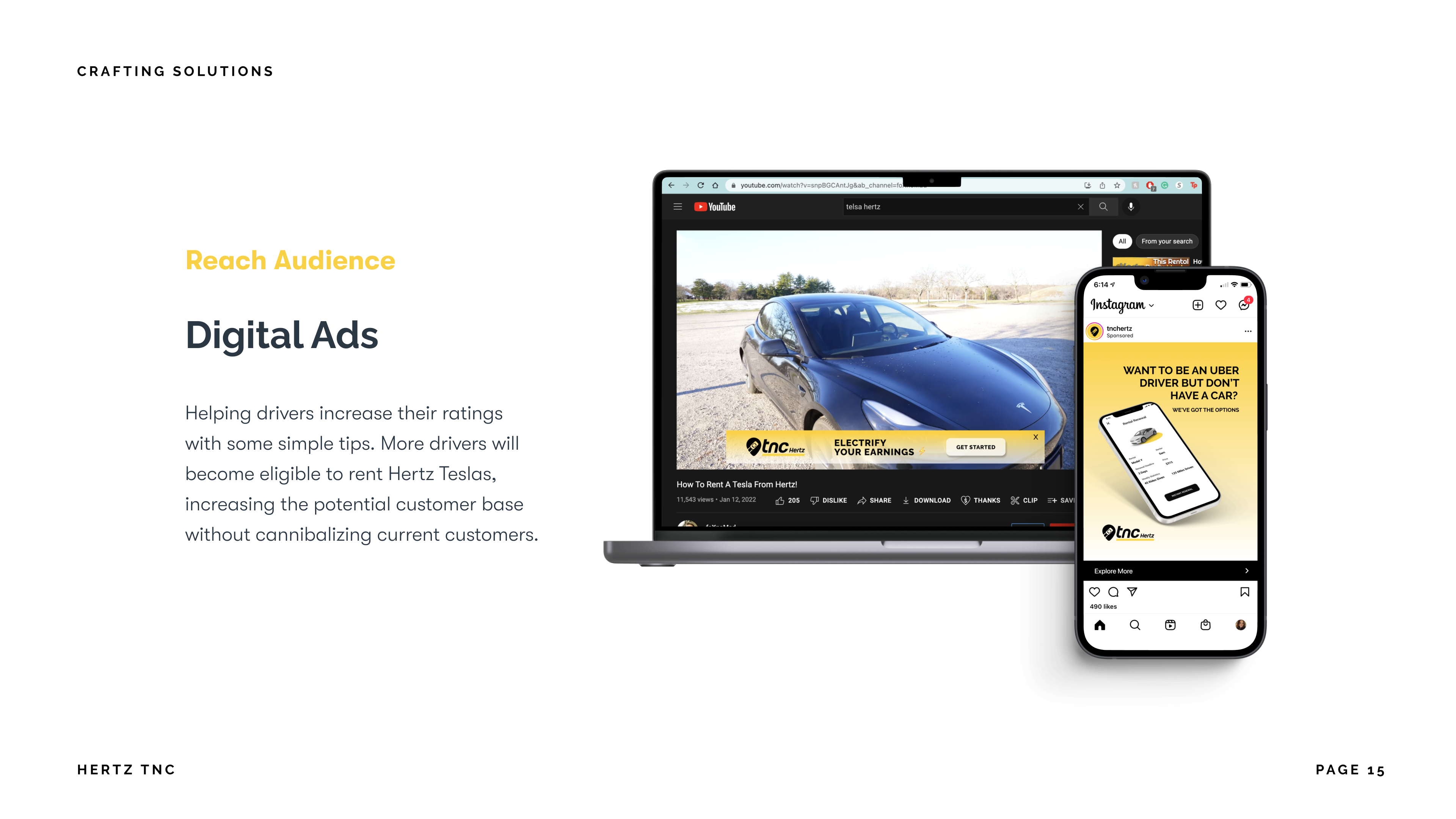
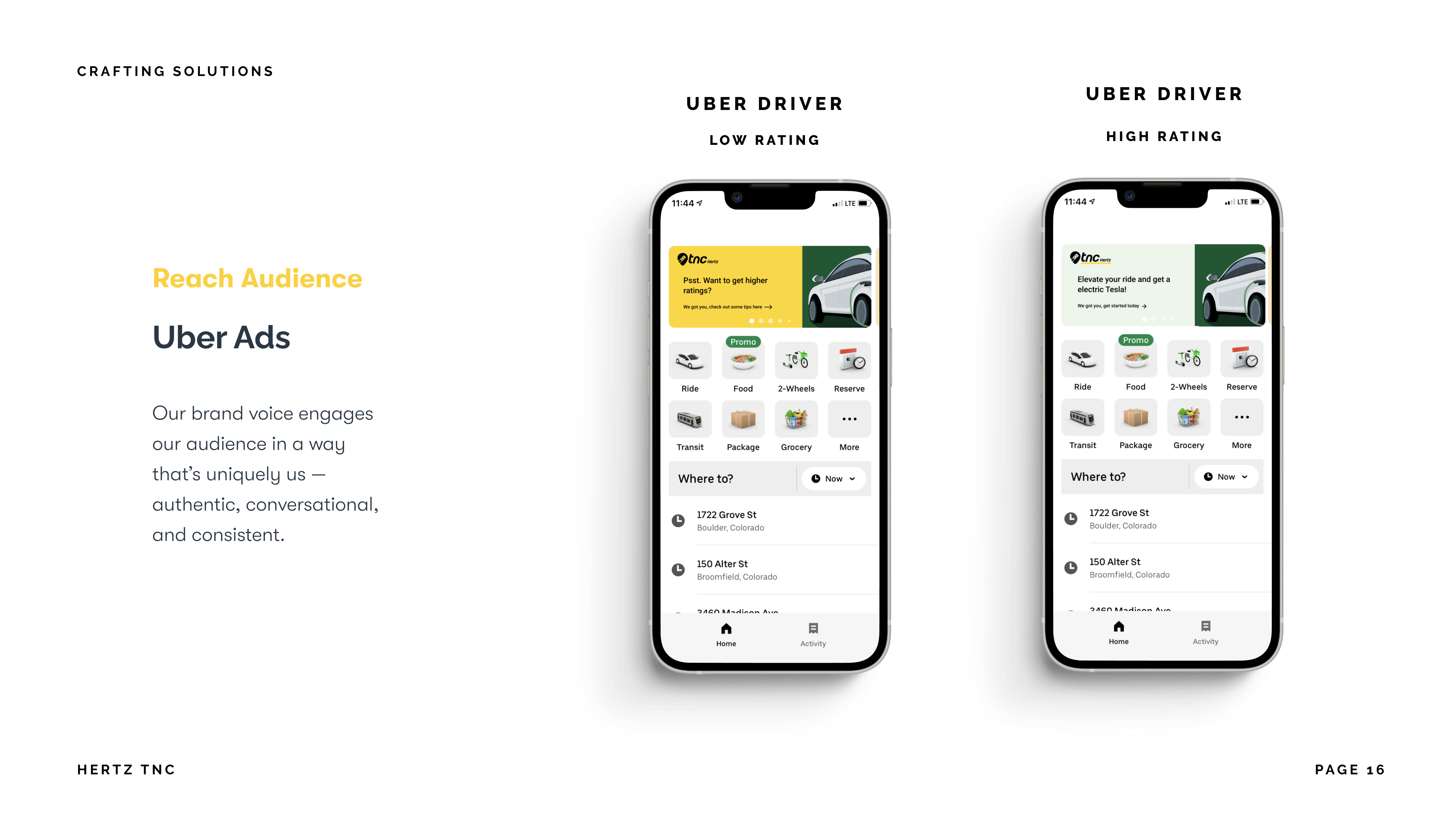
Brand strategy solutions
In addition to developing the mobile tool, I contributed to the overall strategy and ideation of our branding solutions. From this, I was able to help our graphic designer, Olivia, center in her focus on which graphics we needed to develop.
FINAL NOTES
My team presented our work to Hertz product designers and their product manager.
Working with Hertz TNC was a great experience. I not only gained experience in UX/UI design, but also product strategy and product management. I was able to assign and distribute tasks, and work out strategies that would help us define our end goal. I worked with three other designers on this project and being able to find efficient ways to work with each person was a learning experience in itself. Not only did we have the opportunity to present to Hertz team members, but we also received valuable feedback to improve our design process moving forward.
Some feedback included:
“Since TNC encompasses more than just Hertz, we would probably want to change the name.”
“We liked how you created a one stop shop for drivers that eliminates the need to use other platforms to keep track of important information."
